As a new company owner or entrepreneur, building a brand that stands out is one of your top priorities. Your brand’s visual identity, particularly its color scheme, plays a pivotal role in shaping how customers perceive your business. The right colors can evoke emotions, build trust, and create instant recognition, while the wrong ones might confuse or alienate your audience.
In this comprehensive guide, we’ll walk you through the process of choosing the perfect color for your brand, tailored specifically for new business owners and entrepreneurs looking to make a lasting impression in 2025.
Choose colors that reflect your brand’s personality, appeal to your target audience, fit your industry, and are accessible. Start with 3–5 colors (primary, secondary, neutral), and test them across all brand assets before finalizing.
Table of Contents
Why Brand Colors Matter
Colors are more than just aesthetics—they’re a powerful communication tool. Studies show that 93% of consumers make purchasing decisions based on visual appearance, and color alone can increase brand recognition by up to 80%.
Whether you’re launching a tech startup, a boutique bakery, or a consulting firm, your brand colors will appear on your logo, website, packaging, and marketing materials. They shape first impressions and influence how your audience feels about your business.
Step 1: Define Your Brand’s Personality
Before picking colors, understand your brand’s identity. Ask yourself:
- What values does my business represent?
- How do I want my brand to make people feel?
Write down 3–5 adjectives that describe your brand.
Examples:
- Fitness Brand – Energetic, motivating, strong
- Luxury Skincare – Elegant, sophisticated, calming
A “strong” brand might lean toward bold colors like red or black, while a “calming” brand might choose soft blues or greens.
Step 2: Understand Color Psychology
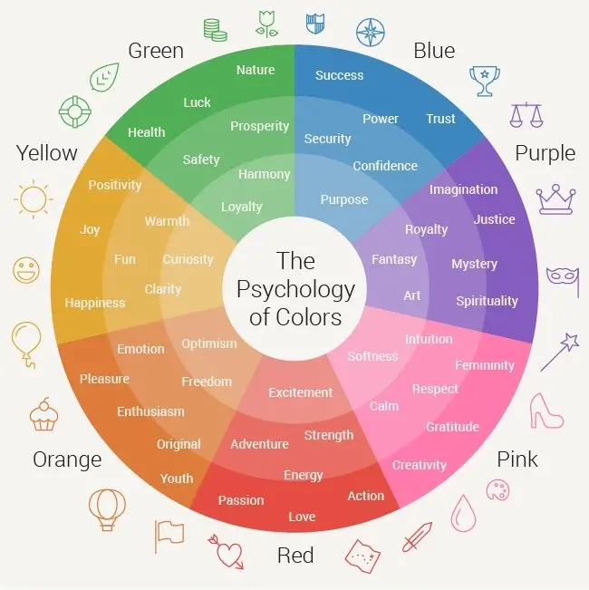
Color psychology studies how colors influence emotions and behaviors. Use this knowledge to connect with your audience on a deeper level.

Quick Overview:
- Red: Passion, excitement, urgency
- Blue: Trust, reliability, calm
- Yellow: Optimism, energy, creativity
- Green: Growth, health, sustainability
- Purple: Luxury, creativity, mystery
- Black: Sophistication, power, elegance
- White: Purity, simplicity, cleanliness
- Orange: Enthusiasm, friendliness, affordability
Example: A sustainable clothing line might use green to reflect eco-consciousness, while a consulting firm might opt for blue to project trust.
Step 3: Know Your Target Audience
Your color choices should reflect your audience’s preferences. Consider:
- Age: Younger audiences (Gen Z, Millennials) may prefer bold, vibrant hues. Older audiences (Gen X, Boomers) often gravitate toward muted or professional tones.
- Gender: Gender-neutral palettes (e.g., green, blue) reach broader markets.
- Location & Culture:
- Red = excitement in the West, but luck in China
- White = purity in Western cultures, mourning in some Eastern cultures
Tip: If targeting a global market, adapt colors for different regions.
Step 4: Analyze Your Industry and Competitors
Certain industries tend to lean toward specific color palettes:
- Tech Startups: Often use blue for trust (e.g., IBM, Dell)
- Food & Beverage: Warm colors like red/yellow stimulate appetite (e.g., McDonald’s, Coca-Cola)
- Eco Brands: Green dominates to signal sustainability (e.g., Whole Foods)
Do: Research competitors to identify trends.
Don’t: Copy them outright. Instead, choose a variation or unique pairing to stand out.
Step 5: Create a Cohesive Color Palette
You need more than one color for a well-rounded brand. Build a palette that includes:
- Primary color (your dominant color)
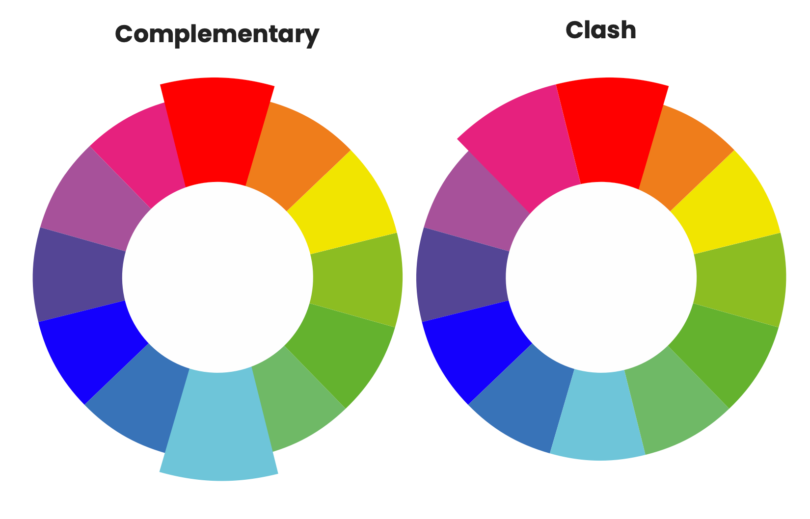
- Secondary colors (1–2 complementary hues)
- Neutral colors (white, gray, or black for backgrounds/text)
Use tools like:
Follow the 60-30-10 Rule:
- 60% primary color (main identity)
- 30% secondary (accents)
- 10% neutral (supporting background/text)
Example Palette for a Tech Startup:
- Primary: Navy blue (trust)
- Secondary: Bright orange (energy)
- Neutral: White (clean, modern)
Step 6: Test for Versatility and Accessibility

Your colors must perform well across all platforms and formats:
- Versatility: Must look great digitally and in print
- Consistency: Work in black-and-white or grayscale
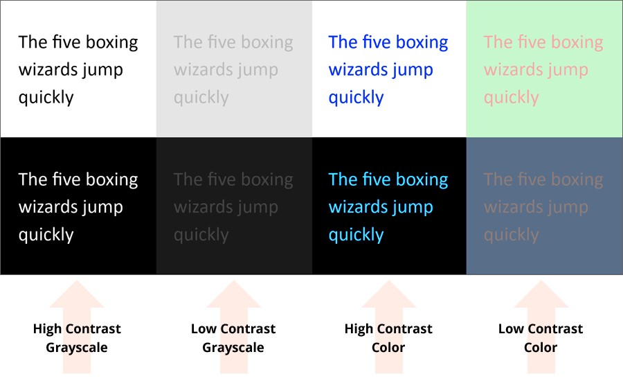
- Accessibility: Meet WCAG guidelines for contrast
Tool Recommendation: WebAIM Contrast Checker
Bad Example: Light gray text on a white background = low readability Better Choice: High contrast (e.g., black text on white)
Step 7: Consider Trends, But Prioritize Timelessness
2025 color trends include:
- Earthy tones (terracotta, sage green)
- Neon accents for Gen Z brands
- Modern gradients
Pro Tip: Use trend colors as accents. Anchor your brand in timeless hues like blue, black, or white to stay relevant for years.
Step 8: Gather Feedback and Iterate
Before finalizing, create mockups of your logo, website, or packaging. Share them with:
- Stakeholders
- Team members
- A small focus group or potential customers
Ask:
- Do these colors reflect our brand?
- Are they appealing and memorable?
- Do they stand out?
Iterate confidently until you find the best combination.
Step 9: Implement and Protect Your Brand Colors
Document your choices in a Brand Style Guide with:
- Color codes: HEX, RGB, CMYK, Pantone
- Usage guidelines: When/where each color should be used
- Do’s and Don’ts: Examples of correct and incorrect usage
Maintain consistency by sharing the guide with your team and any external partners.
Common Mistakes to Avoid

- ❌ Using too many colors (stick to 3–5)
- ❌ Ignoring cultural meanings
- ❌ Overlooking accessibility
- ❌ Copying competitors
- ❌ Choosing colors based on personal taste alone
🌟 Bonus: Brand Spotlight
Spotify uses a bold green paired with black and white. The green suggests energy and freshness, setting it apart in a field dominated by blue-themed tech brands.
Final Thoughts
Choosing the perfect brand color is both an art and a strategy. Align your palette with your personality, audience, and industry, and test thoroughly before launch.
Your brand colors aren’t just design elements—they’re a reflection of your mission and message. Choose wisely, and they’ll help your business leave a lasting impression.
💬 Need expert help bringing your brand to life?
Whether you’re starting from scratch or refining your visual identity, WebMeeDee is here to help.
👉 Contact us today and let’s make your brand unforgettable.

